
A blog today to introduce my online exhibition for May 2018 (now finished) ‘Creating Mood With Atmospheric Black and White Images’. In fact I wrote a blog last year with a similar title ‘Creating Mood With Black and White and Shades of Grey‘ and the idea for the exhibition sprang from there.
A Deliciously Textured Exploration of Scenes in Black and White
Why ‘delicious’?
I use the phrase ‘deliciously textured’ as we talk about art being a feast for the eyes. Many times in my blog I have said that I am seduced by colour. I produce little black and white work but when I do it is usually heavily textured as I like them to be chunky.
A Tale of Two Images
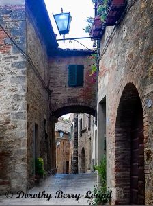
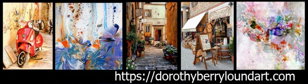
Recently I was asked by some local clients in Italy for some black and white images. I really don’t have that many local images in black and white (but guess what is on my list as my next project?). The local images I have tend to reflect the colours of the landscape, wild flowers, local towns, Lago Trasimeno etc. It took a bit of thinking about what I had available to come up with something to show them.
I showed one client this local scene from Cetona that on a whim I had created as both a black and white and colour version. Much to my surprise she prefers the black and white image whereas I prefer the colour version. I have put them both here so you can compare them. Which do you prefer?
The black and white version is in the online exhibition.
Deliciously Textured Architecture
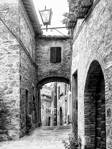
Brighton Pavilion
One of my most popular images is this one of the Brighton Pavilion in the UK. This is a very ornate building but is actually very pale in colour. I did a series of images of this glorious architecture from different perspectives and the others are true to the lighter tones of the building.
With this image I used the heavy tones and texture to get across (I hope) the gravitas of the building. After all, it was a royal residence long before it became a tourist attraction.
Blackfriars Bridge London
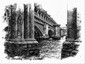
A relatively new black and white image follows a recent two day photo shoot in London (my visit is talked about in an earlier blog called ‘Images Emerge From Miserable London Mizzle‘). I took several shots of Blackfriars Bridge in London.
I loved the contrast between the new railway bridge and the remaining bright red pillars from the previous bridge (you can see a colour image of the bridge here). And yet, there was something about the architecture that made me think of a tonal treatment. I was drawn to the weathering on the red pillars, lost on first glance because your eyes go to the lovely bright red. The resulting image is heavily textured to reflect that weathering. I think it works too.
Boats Also Get The Treatment
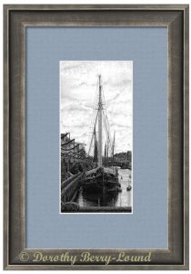
I also like the dark, textured treatment when it comes to boats. This image ‘Calm Mooring’ is based on a photograph I took in Copenhagen a couple of years ago. It is shown here as a framed print just as a suggested finish.
There are two similar boat images. The other one is called ‘Moored Sail’. I think the two make make a nice matching pair.
But which do you prefer? Colour or black and white images? Tell me in the comments.
Before you go

My name is Dorothy Berry-Lound an artist and writer. You can find out more about my art and writing at https://dorothyberryloundart.com.
You can follow me on Facebook.
Thank you for reading!
I love the black and whites you do because of the texture. I am like you as I prefer color images normally. These are B&W you took are visually stunning.
Thanks Theresa I am glad you like the images, it is lovely feedback.
Your images are beautiful, Dorothy. I love the timeless feel of these!
So glad you like them Sharon