
I use a lot of colour in my photopainting artwork. It might surprise you to know that I also venture into the area of black and white, shades of grey and low colour on occasion. It is surprisingly effective too.
Creating Mood in Black and White and Shades of Grey
How do I define Black and White?

My definition for what constitutes ‘black and white’ includes monochromatic, selective colouring, sepia, high key, high contrast, and desaturated colours of 50% or more.
This is a challenge for me as working in black and white is not my natural inclination. It is good to be pushed to try new things though. ‘Jolies Choses’, which means pretty things in French, was created specifically for a competition on black and white still life – I saw it as a personal challenge.
Shades of Grey
You could argue that ‘black and white’ doesn’t actually exist. It is a gradient, or polarity, with black at one end, white at the other and shades of grey in between.
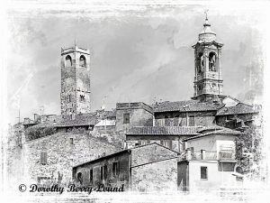
This is shown to good effect, I think, in my piece ‘Citta della Pieve Skyline’. This is an old medieval town. I wanted to get the age across. Using colour in this image would have detracted from the textures of the brick and stone work. Not to mention the tonal quality of this wonderful architecture. Making it a black and white, and then adding shades of grey as a textured layer really makes this image work for me.
Dark Tonal Shades
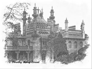
Another piece that takes the concept of gradients and moves into darker shades of grey is ‘Brighton Pavilion Black and White’.
Now this is an exaggerated black and white, emphasising the detail on this incredibly ornate building. But I also added dark tonal shades to really give the impression of the size and solidity of the building and how it dominates it’s landscape.
Other images I have created of the Pavilion are more pretty, softer, paler and showing the grace of the building. This one shows the building as a powerful statement which was of course the intent of the architect.
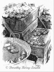
I also used this dark tonal shading approach in a completely different piece ‘Rustic Tomatoes For Sale’.
If I had produced this piece in colour, your eye would immediately have been drawn to the red of the tomatoes. Instead, by making it a tonal with grey textures I was able to bring out the story of the shapes and contrast in natural textures. For example the look of the tomatoes in the sand in the foreground, or the gloss and shape of the tomatoes on the wooden crates.
The Captive Mind

One of my pieces, ‘The Captive Mind’ really takes the black and white application to extremes. Again there is a story behind the piece.
This image is a metaphor for a closed mind. Someone who is not open to other people and has no compassion for the situation of others. The mind is depicted as a person bound in restraints, obviously being held captive. But the lack of colour speaks to the lack of compassion, imagination, the ability to see all sides of an argument.
The Lighter Side of Black and White
With the exception of the still life, the images I have chosen for today’s blog are quite heavily textured. Not all of my black and whites are like that. So I wanted to finish with a couple of images that are a bit lighter.
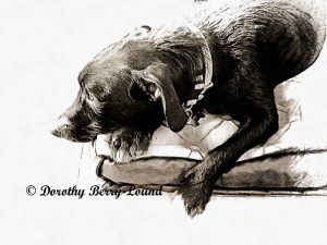
The first ‘Lost in Thought‘ shows my dog Spud. He is completely away with the fairies, day dreaming. By stripping away the background detail and reducing the image to two tone, I was able to get across that ‘not completely here’ feeling.
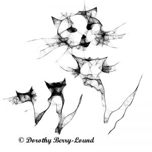
The second image ‘Keep It In The Family’ is a simple ‘scribble’ I produced using just my right forefinger and Scribbler Too software. It depicts a mother cat addressing her family of kittens. She is telling them how she wants to see behaviour change and less cat napping on the job.
It also reminds us that we shouldn’t take ourselves too seriously!
Before you go

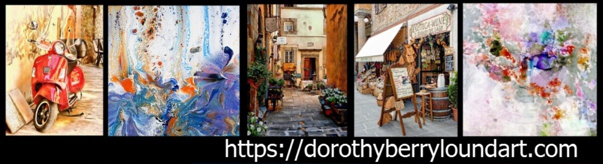
My name is Dorothy Berry-Lound an artist and writer. You can find out more about my art and writing at https://dorothyberryloundart.com.
You can follow me on Facebook.
Thank you for reading!
Leave a Reply